Article overview
- A Shopify cart has one job: confirm what the buyer chose and get them to checkout without a new doubt. Whether you use a cart page or a cart drawer matters less than whether the checkout button is visible, the total is believable and nothin...
- This guide covers the choice between the two, what belongs in each, and a checklist to run on a phone.
- Many Shopify themes let you pick the cart type in the theme settings. Shopify's theme settings documentation describes a drawer, a full page and a pop-up notification. Your theme may offer a different set.
- If you are unsure, look at your orders. A store where most orders contain one item gains little from a drawer built for adding more. A store with five items per order loses buyers if each addition sends them to a new page.
Putting this workflow into practice? Explore Shopify CRO Consulting for implementation scope, controls, and next steps.
A Shopify cart has one job: confirm what the buyer chose and get them to checkout without a new doubt. Whether you use a cart page or a cart drawer matters less than whether the checkout button is visible, the total is believable and nothing in the cart invites the buyer to leave. Choose the drawer when buyers usually add several items, and the page when orders are larger or need review. Then fix the cart in the order of what blocks checkout.
This guide covers the choice between the two, what belongs in each, and a checklist to run on a phone.
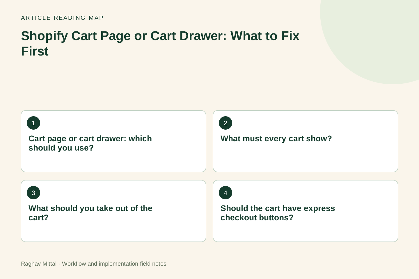
Cart page or cart drawer: which should you use?
Many Shopify themes let you pick the cart type in the theme settings. Shopify's theme settings documentation describes a drawer, a full page and a pop-up notification. Your theme may offer a different set.
| Cart drawer | Cart page | |
|---|---|---|
| Best when | Buyers add several low-priced items and keep browsing | Orders are large, configured or bought for a business |
| Strength | Keeps the buyer on the product or collection page | Room for delivery details, notes and a full order review |
| Weakness | Little space; the checkout button can fall below the fold on phones | An extra page load between product and checkout |
| Watch for | App widgets crowding the drawer | Distractions such as large recommendation blocks |
If you are unsure, look at your orders. A store where most orders contain one item gains little from a drawer built for adding more. A store with five items per order loses buyers if each addition sends them to a new page.
What must every cart show?
- product name, image, variant and quantity, all editable
- the price of each line and the subtotal
- what the buyer will pay for delivery, or when they will find out
- a checkout button visible without scrolling on a phone
- for subscriptions, the delivery frequency and the price of each renewal
Delivery deserves the most care. If the cart says nothing about shipping, the buyer meets the charge for the first time inside checkout. State the free-shipping threshold or a flat rate if you have one. If rates vary, say that delivery is calculated at checkout.
What should you take out of the cart?
Anything that sends the buyer somewhere else or makes the total harder to trust.
- A prominent discount code field when you rarely issue codes. It prompts buyers to leave and search for one. The checkout has its own field.
- Several upsell blocks. One relevant suggestion can help. Three carousels push the checkout button down the screen.
- Countdown timers and stock warnings that are not real. Buyers notice, and it costs trust.
- Notes and gift options nobody uses. Check how many orders in the last three months used them.
- Duplicate trust badges. One line about returns and secure payment is enough.
Every app that adds a widget to the cart also adds a script. The app stack audit explains how to find the ones that slow the page without earning their place.
Should the cart have express checkout buttons?
Shopify calls these accelerated checkout buttons. Its accelerated checkout documentation describes them on product pages and at the start of checkout, with methods such as Shop Pay, Apple Pay, Google Pay and PayPal. Many themes can show them in the cart as well. They let a returning buyer pay with saved details and skip the forms.
They help when a large share of your buyers already use one of those wallets, which you can check from the payment method on past orders. They get in the way when they sit above the main checkout button and a buyer with a discount code or a delivery note taps one by mistake. Place the standard checkout button first, test the express buttons on a real phone in your main markets, and check that your discount, note and subscription flows still work when a buyer uses them.
How do upsells in the cart affect conversion?
A cart upsell trades a little friction for a chance at a larger order. Whether the trade pays depends on relevance. An accessory for the product in the cart, at a low price, added with one tap, is a reasonable offer. A generic "you may also like" row is mostly a distraction.
Measure it instead of assuming. Compare cart-to-checkout rate and average order value for a few weeks with the upsell on and a few weeks with it off, and note anything else that changed in that time. If order value rises and fewer buyers reach checkout, work out which effect is larger in revenue. For stores that sell sets, the bundle structure guide covers offers that are better made on the product page than in the cart.
Worked example: a cart checked on a phone
Illustrative scenario: a store uses a cart drawer. On a phone with two items in the cart, the drawer shows, from top to bottom: a free-shipping progress bar, two line items, a recommendation carousel, a discount code field, a gift note box, three express payment buttons and then the checkout button.
| Check | Finding | Change |
|---|---|---|
| Is the checkout button visible without scrolling? | No, it sits below the carousel and the note box | Move it directly under the subtotal |
| Is delivery cost stated? | Yes, through the progress bar | Keep |
| Does anything invite the buyer to leave? | The discount field and the carousel | Remove the field, keep one suggestion below the button |
| Are options used? | The gift note appears on very few orders | Remove it or move it to the cart page |
This is an invented example to show the method. Nothing in it needed new software. Each change was a reorder or a removal, and each can be reversed if the numbers get worse.
How do you know the cart is the problem?
Compare sessions that added to cart with sessions that reached checkout in Shopify's behaviour reports, split by device. If that rate is much lower on mobile than on desktop while the checkout itself completes at a similar rate on both, the cart on phones is where to look. If both devices lose buyers inside checkout instead, the cart is not your first fix.
A cart checklist to run on a real phone
- Add one item. Can you see the checkout button without scrolling?
- Add a second item. Is the button still visible?
- Change a quantity and remove an item. Does the total update at once?
- Is the delivery cost, or when it will be shown, stated?
- Add a subscription product. Are the frequency and renewal price shown?
- Tap each express payment button, then go back. Does the cart still hold your items?
- Apply a discount code where your store expects it. Does the total change?
- Load the cart on mobile data. Does anything shift after the page appears?
Write down every hesitation. Then rank the findings by how many buyers they affect, using the CRO audit framework.
The cart is one of the areas I review in Shopify CRO consulting. For a second opinion on yours, request a free store audit or send me your store link and your cart-to-checkout rate by device.
Frequently asked questions
Is a cart drawer better than a cart page on Shopify?
Neither is better in general. A drawer suits stores where buyers add several items and keep browsing. A page suits larger or more considered orders that need review. In both, the checkout button must be visible on a phone without scrolling.
Should I show a discount code field in the cart?
Only if most of your buyers arrive with a code. Otherwise the field prompts buyers to leave and look for one. Shopify's checkout already has a discount field, so removing it from the cart does not stop codes from working.
How many upsells should a Shopify cart show?
One relevant offer at most, placed where it does not push the checkout button down. Measure cart-to-checkout rate and average order value with and without it before keeping it.

Founder, The Night Marketer (Shopify Select Partner). The agency has served 450+ brands since 2015.
Shopify CRO Consulting
I lead Shopify CRO engagements for D2C brands worldwide, with The Night Marketer (a Shopify Select Partner) handling design, development and testing. Every engagement starts with evidence: Shopify analytics, GA4, session recordings, device and traffic-source splits, and a walk through your real buying journey. The output is a prioritised backlog ranked by expected revenue impact and effort, then the fixes shipped and measured.